I feel like it has been a minute since I shared about my watercolor painting. I can’t remember how much I have shared, but I have a nice project that ends in a quilt. I signed up to take a watercolor class, for college credit, at my local community college. There is a weekly meeting with a discussion, followed by an assignment. My professor is Kulvinder Kaur Dhew, and her work is amazing. I’m enjoying the class, and she encourages me to work quilts into my paintings. Painting is also influencing my quilting. Hence, the Regatta Mini Quilt.
Last week’s assignment started with discovering an artist and appropriating their work. My apologies to my inspiration for copying your work. The professor made me do it. I guess it is part of learning to make art.
I love the work of Patrick Lynch of Swartswood Studios. I believe he works with wood cuts and paint, although I haven’t had the opportunity to visit his gallery. Since my drawing skills are so rudimentary, I like to find other artists who use simple shapes in their work to great effect. Patrick’s leaf pieces are beautiful, and the impact comes from the repetition of shape in changing colors. They are still simmering in my mind, though. That idea of working in a series with one very simple shape is compelling for quilting.
His piece called “Wooden Sailboats” is what drove me yesterday. We are at the end of our first boating season, which is bittersweet. While I love the snap of autumn in the air, I will miss being able to go out in the boat in the morning and enjoy the serenity of the lake.
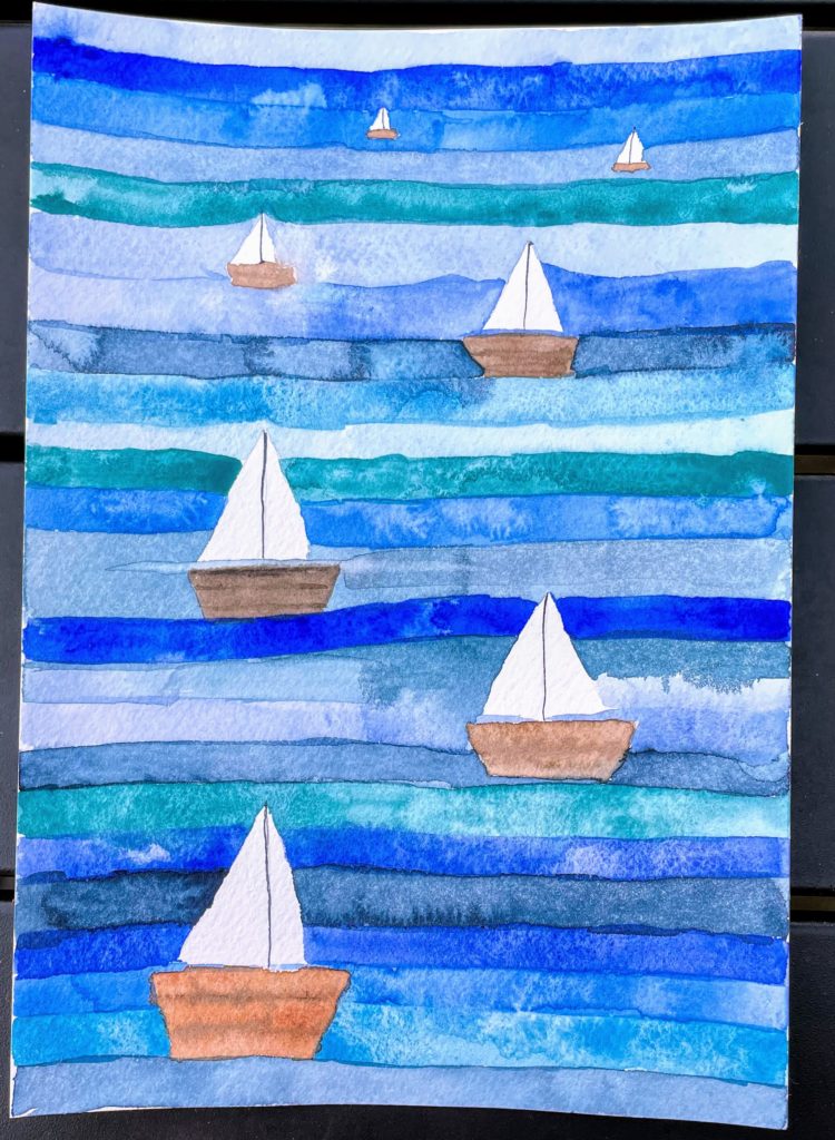
I decided to try painting that piece. I started by drawing very simple boat shapes on my paper. (Stonehenge Aqua Coldpress, 100% cotton, 140 LB, 7” x 10”.) I drew them lightly with pencil. My recent practice of drawing sailboats is helping. I then used the range of blues already in my palette. All are Winsor & Newton Professional tube paints. Cerulean, French ultramarine, cobalt, and cobalt turquoise, along with a subtle mix of whatever was on the palette. I used my Grace Art #10 flat brush to make lines. Initially I tried to allow the lines to dry, but I wasn’t paying enough attention and got some bleeding between blues. I liked it, so I then did it intentionally. The hulls are painted with two browns from the same palette.
I don’t love my sailboats on this one – they are in columns, which was unintentional. The hulls are also too chunky. I want them to be more of a random scatter. The perspective can be improved, too. I do like it, but it has room for improvement.
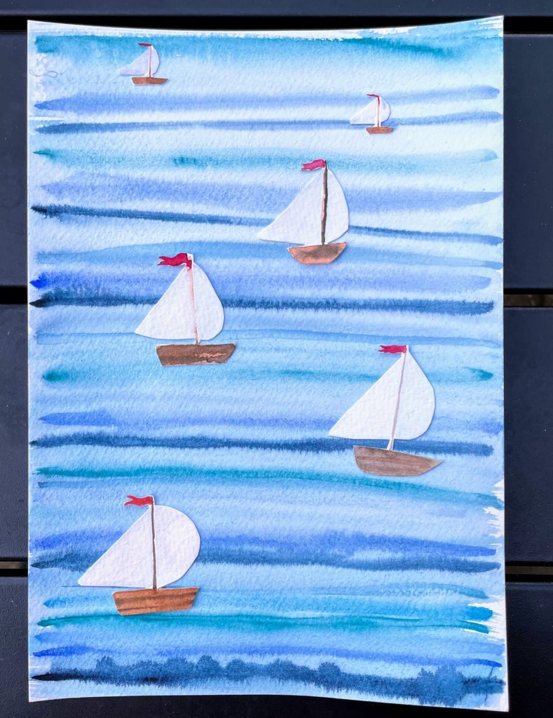
For my second version, I did a wet on wet technique, inspired by watching a video by Scott Swinson. I’m not ready to be as wild as he is, but I did thoroughly wet my paper, then run heavy lines of paint across it using a round brush, #6. Then, since they didn’t bleed enough, I went over the while piece with my mop brush again, smearing the lines. I painted the sailboats on scrap paper, cut them out, and glued them onto the background. It feels a little like cheating, but I got the effect I was seeking. Cutting out watercolor paper with scissors is difficult, and I may not do that again. My lines are not as substantial as the original, and I think the impact is lost a bit with the thin stripes and the large range of color values. I do like the pop given to the piece by the red flags. This is also on 7” x 10” paper. (I might try this wet on wet again with blobs instead of lines.)
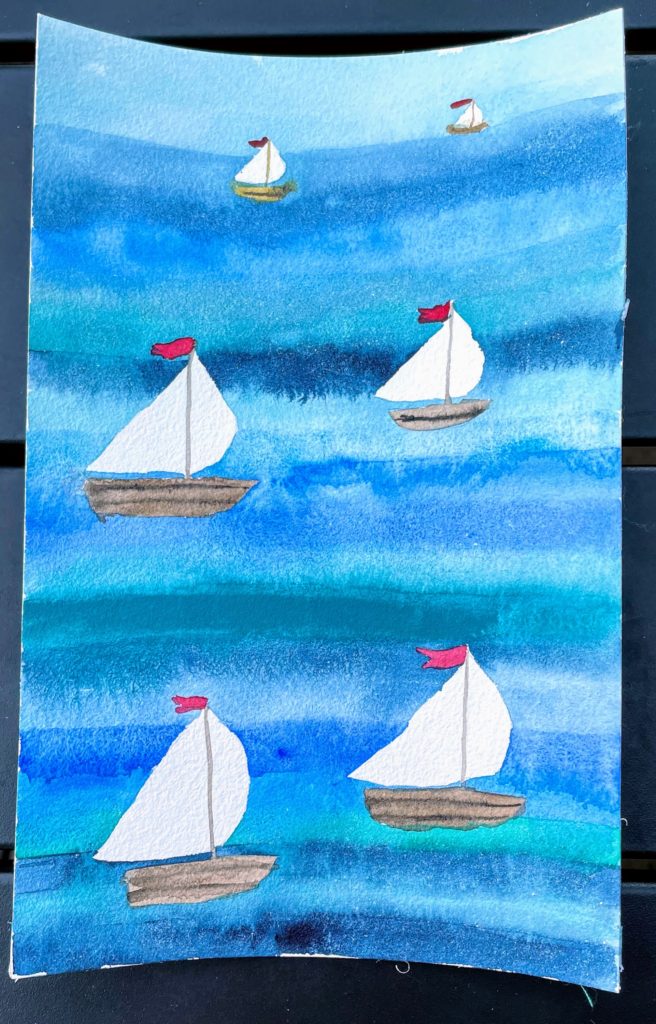
My third painting reverted back to the original piece – I drew the boats, plus flags, then used my flat brush to make paint lines again. This time, I started at the bottom of the paper and went up, allowing the thicker lines to bleed into each other. I tried to have the colors gradually lighten towards the top, to enhance the horizon line at the top of the painting. This is definitely my favorite painting version. I’m not sure that I want to paint it again. Well, maybe just once more. I accidentally have an even number of boats, and my one line of cerulean blue is too dense. Once I use up what is in my palette I’ll be replacing cerulean with a different color. I don’t care for it – it is too opaque. I used my Academy paper block for this one – it is smaller, close to 6” x 8”. It did warp quite a bit – it has an appointment with my iron later today.
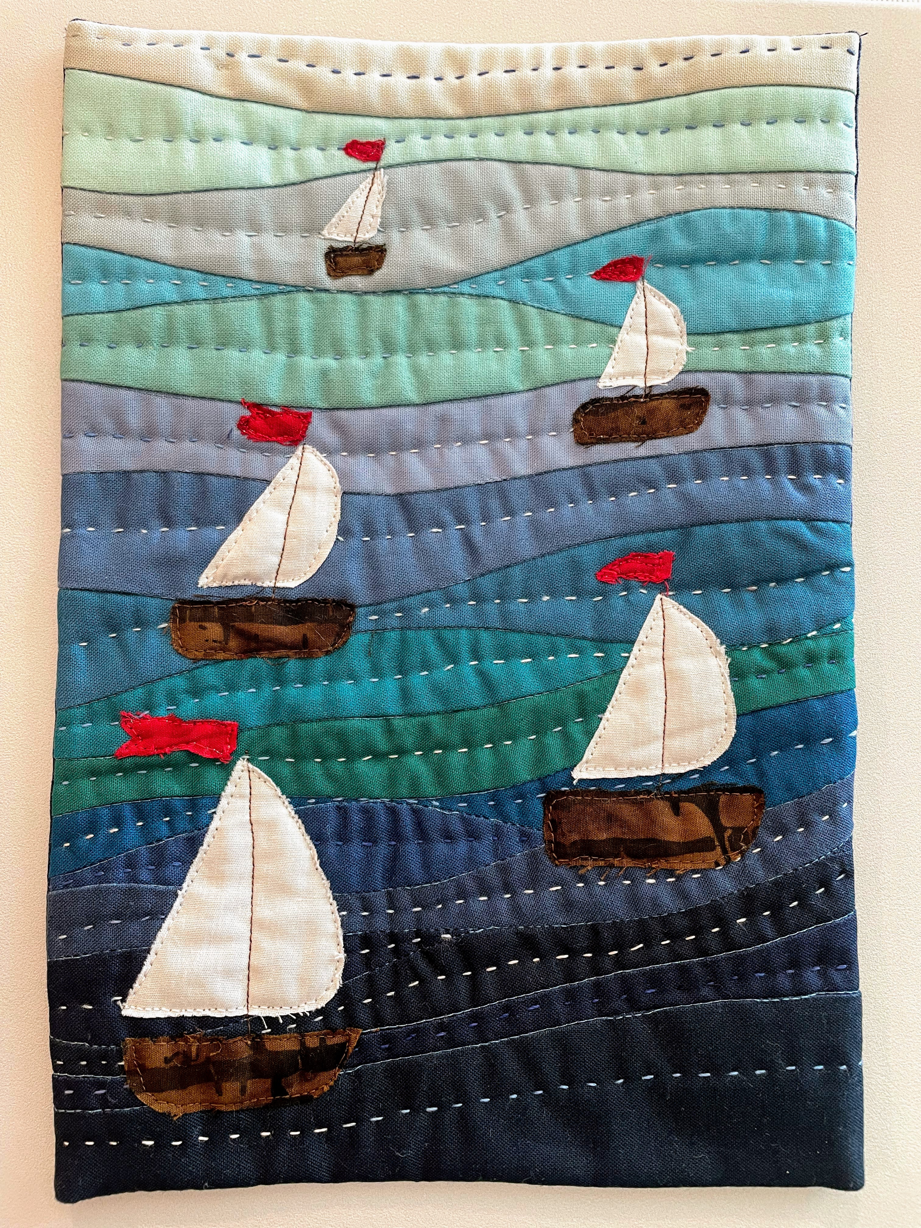
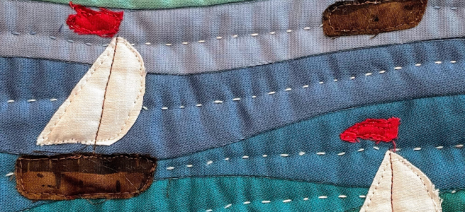
My next version moved into fabric. It is 7” x 10”. I began with pulling an assortment of 20 blue fabrics from my solid collection. I narrowed it down to 14 colors, allowing a bit of green and grey to sneak into the blues. I cut 2 ½” x 9” strips of each color, then used improv piecing to make the curvy background. Next, I quilted the background to the batting, using free motion quilting in a medium blue thread. I quilted in the ditch, so the stitches are not very visible, just enhancing the texture of the piecing. I free-hand cut the hulls, sails and flags out of scrap batik fabric, pinning them in place across the piece. They were then free-motion quilted in place, using brown, white and red thread. I then added a back to the piece, and hand quilted using a 12 weight variegated blue and white thread. I bound the quilt using a facing, so that there is no frame to detract from the image. I am so in love with this piece that it has been submitted to Studio Art Quilt Associates to become part of their traveling trunk show exhibit. It will travel the world for the next three years, helping spread the word about art quilting.
I will be making my Regatta mini quilt again, probably a series of minis, along with a functional size. I want to find some thread with more blues, less white – I love this one, but I feel like less contrast in the hand quilting thread would be better. Part of the issue with this one is the long pitch – once it turns white, it stays white for a long time. Perhaps a blue/green variegation would be effective.
I hope you enjoyed my art class journey for this week. I’ve been doing this kind of thing for each assignment, although this is my first quilt. I do make the assignment over and over, changing things and evolving, then writing a long analysis piece. It is helping me find my creative voice, and I think it is helping me make better artwork.
This is really fun! Love seeing the all the different painting techniques and then the quilt! I definitely can see a series of these.
Working in a series can be so powerful. I don’t know much about painting, but I liked reading about the different approaches you tried with the watercolor series and I look forward to seeing how the series evolves in quilts for you.