I’m back with another Imagination Renovation quilt designer challenge this month. Kate and Tammy chose the Strip Star for September. This was one I was not familiar with, but it has some potential.
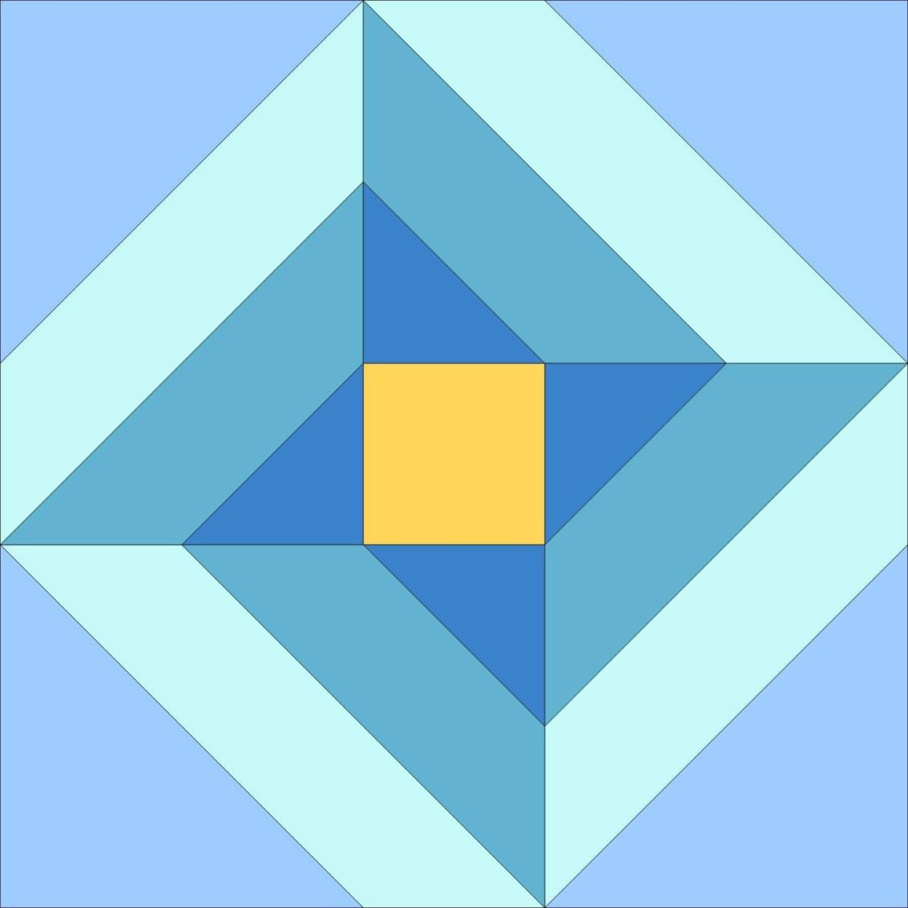
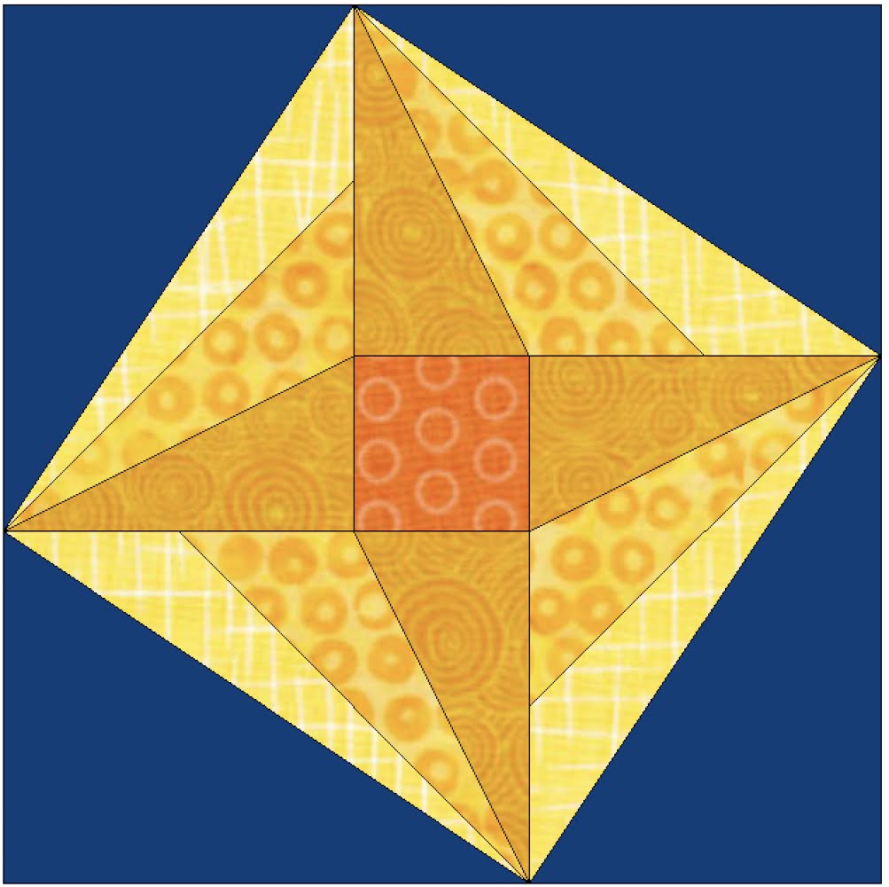
I immediately went right to Electric Quilt 8 and got playing with the strip star block. First, I moved some lines, pulling that center star out to the edge of the block. I liked the sense of motion this gave me. These are some of the basic fabrics in the EQ8 library. I never bother putting in specific fabrics unless I am working on a project for a magazine. For myself, I’m just looking for color and texture.
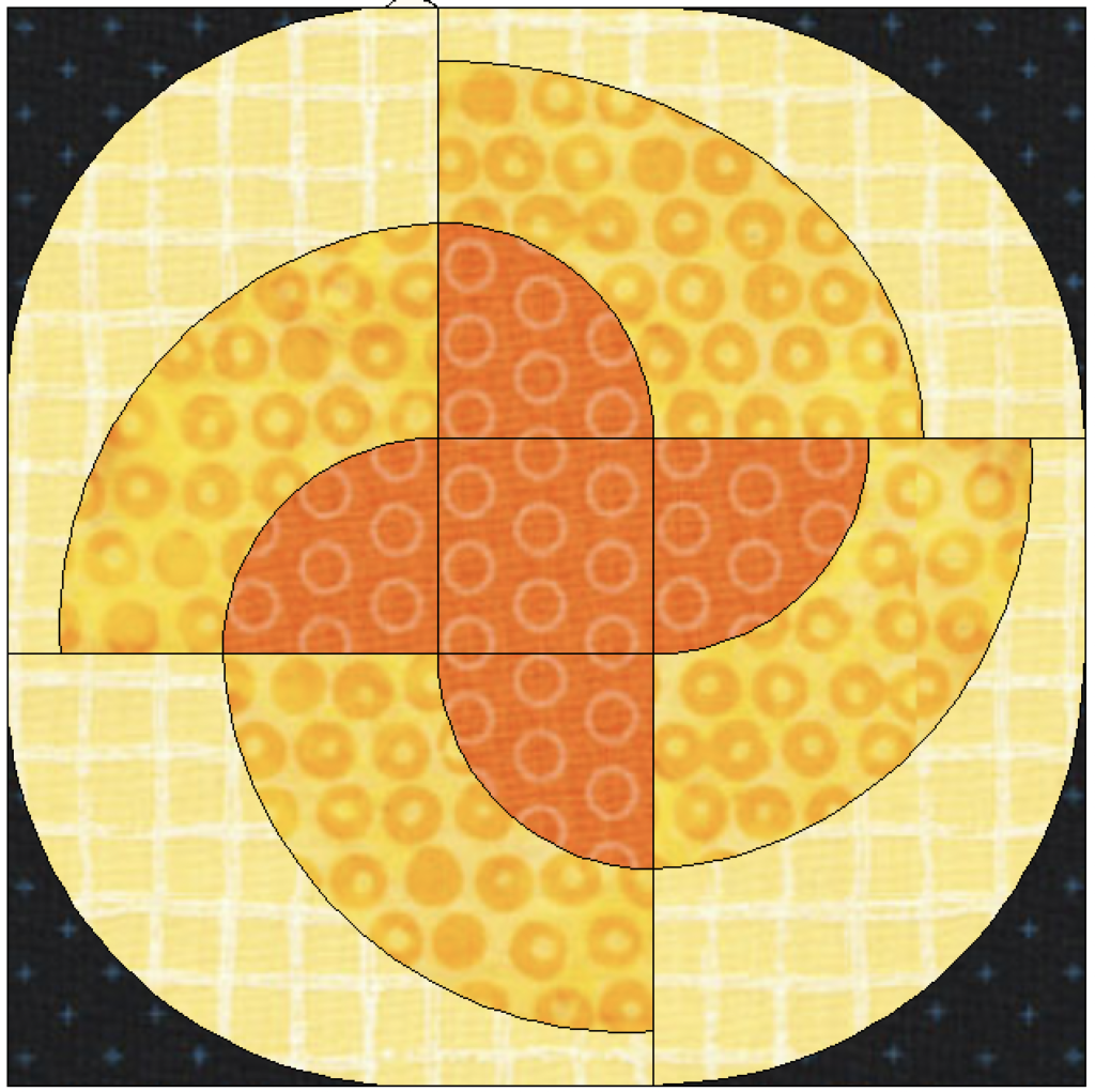
Then I tried a version with curves. I was particularly thinking of my oval curved templates from Papper Saxten. I’ve had them for years and have yet to use them. This was my drawing. Interesting. I think I would like to see the curves come to a point as they spin around, but I don’t know how to draw that in EQ8. I don’t like the blunt stop of the yellow with the orange circles.
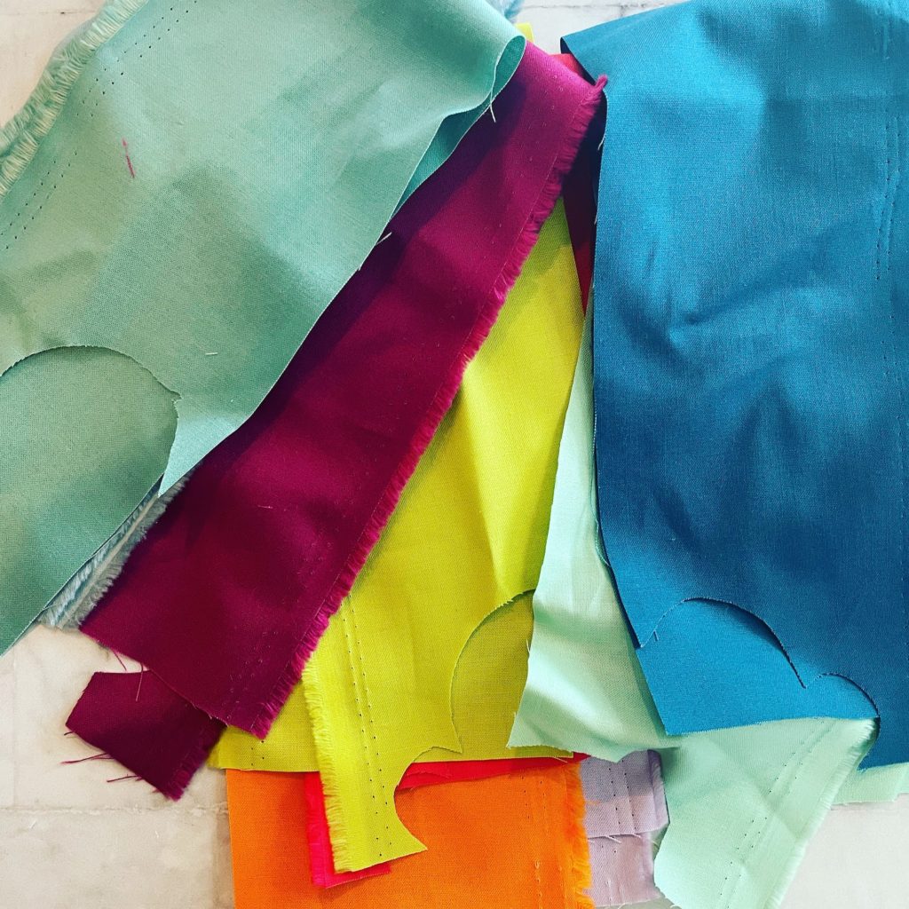
I chose to use scraps from a Kona bundle that has been getting dusty on my shelves. I also used this fabric as the scattered dots in my improv quilt I did with Irene Roderick. I love the fun colors.
This was my first block. Nope. The templates work beautifully, but this design is lacking something, for sure. For one thing, there are only two fabrics in the star, and the drawing calls for more. The templates only give me these two, though, and I’m not interested in working with paper templates. The white background I added isn’t helping, either. This sad block is going to the orphan pile.
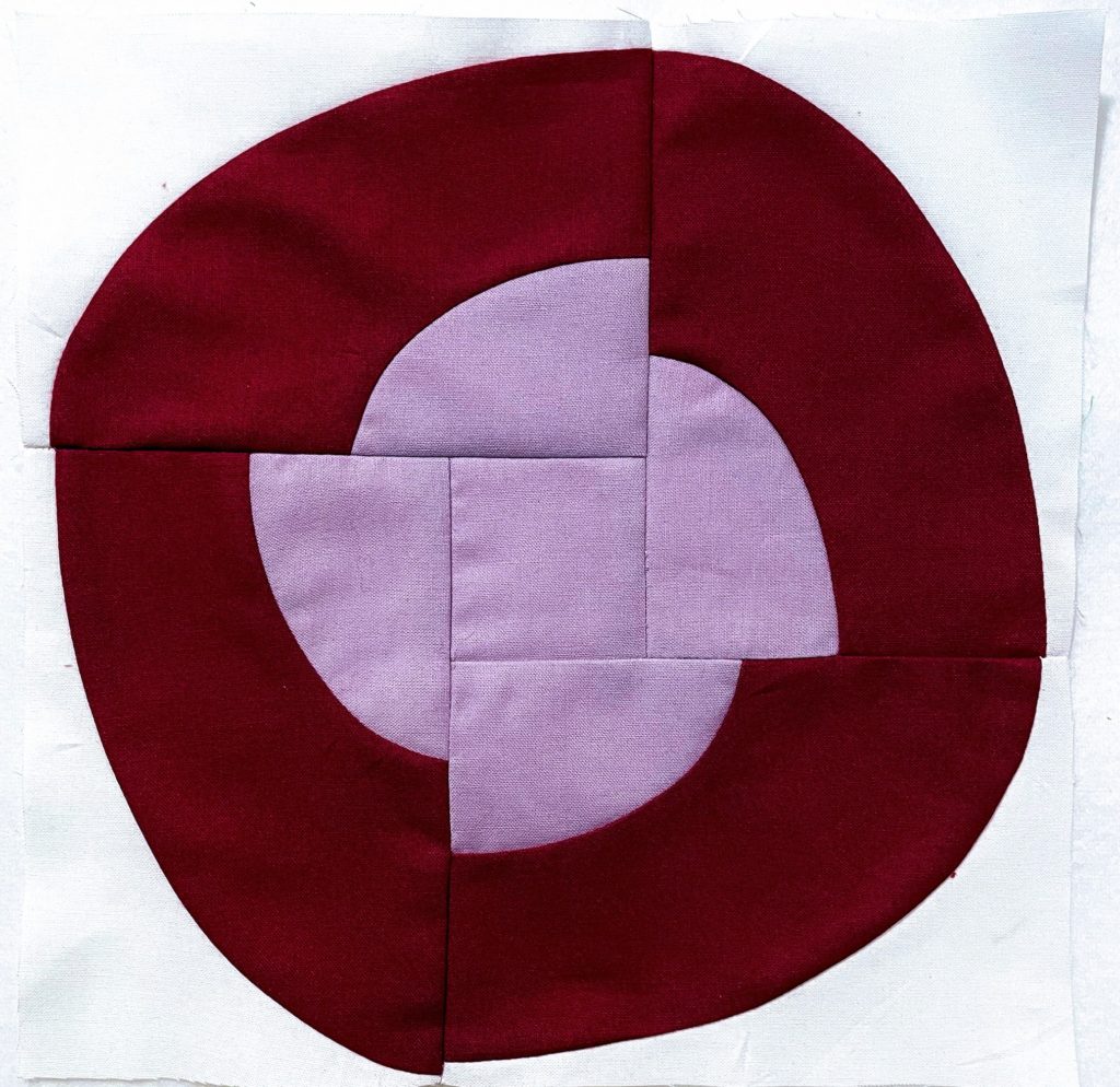
I went back to the original drawing, with the stretched star. I love curves, but I can’t just ram them into everything. Don’t get me wrong, I’m still considering curves here, but I’m not going to solve the curves mystery in September. For now, this designer is sticking with what she knows she can achieve, without swearing or crying.
I printed out the block as a foundation piecing pattern. Then I added Kona Storm to the bundle, giving my colorful stars a celestial background to float in. The colors in this first block are Celery, Limelight and Olive.
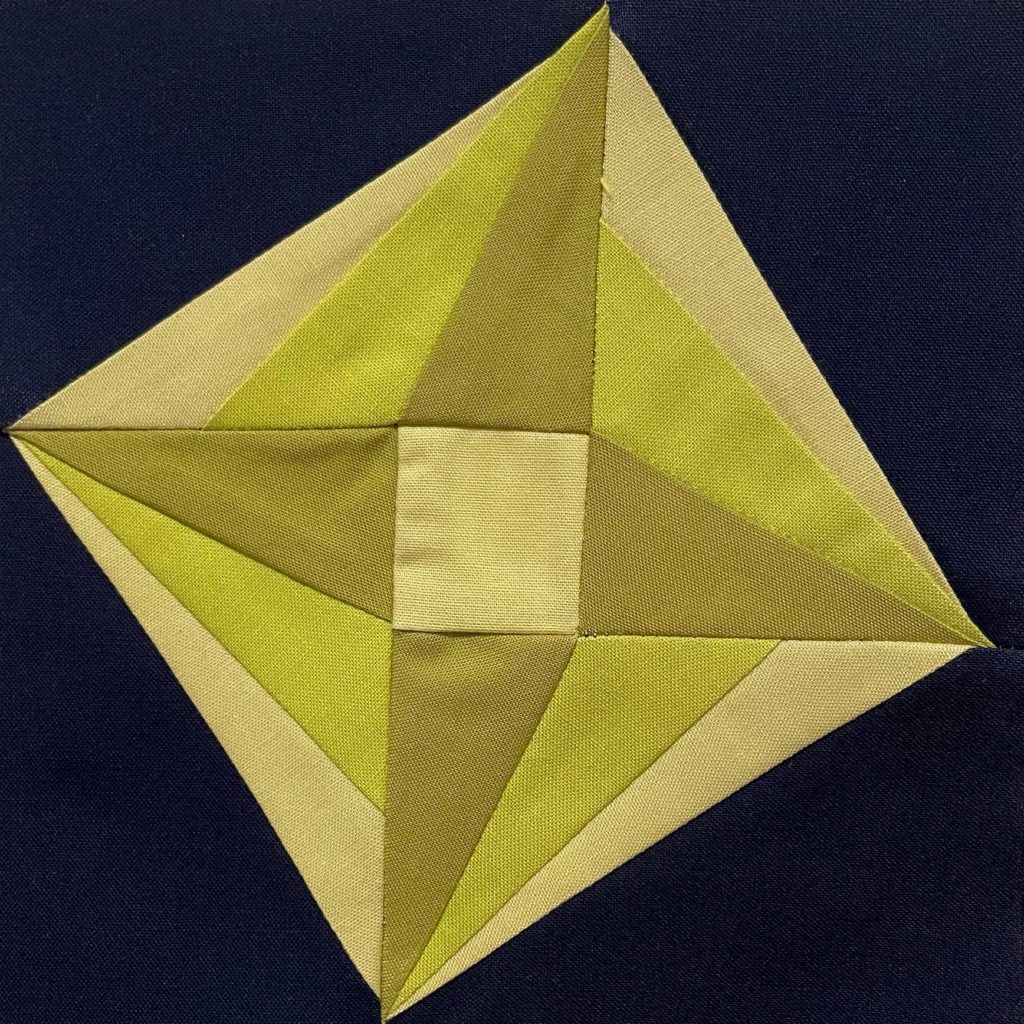
The blocks finish at 6″, which is one of my favorite block sizes. It is small enough that I can fit a lot into even a baby quilt, but not so little that I feel overwhelmed by tiny pieces. I envision this as a perfect scrap buster, as long as the background stays the same, or at least similar. I’m excited to use up some of my scraps making a full size version. Someday.
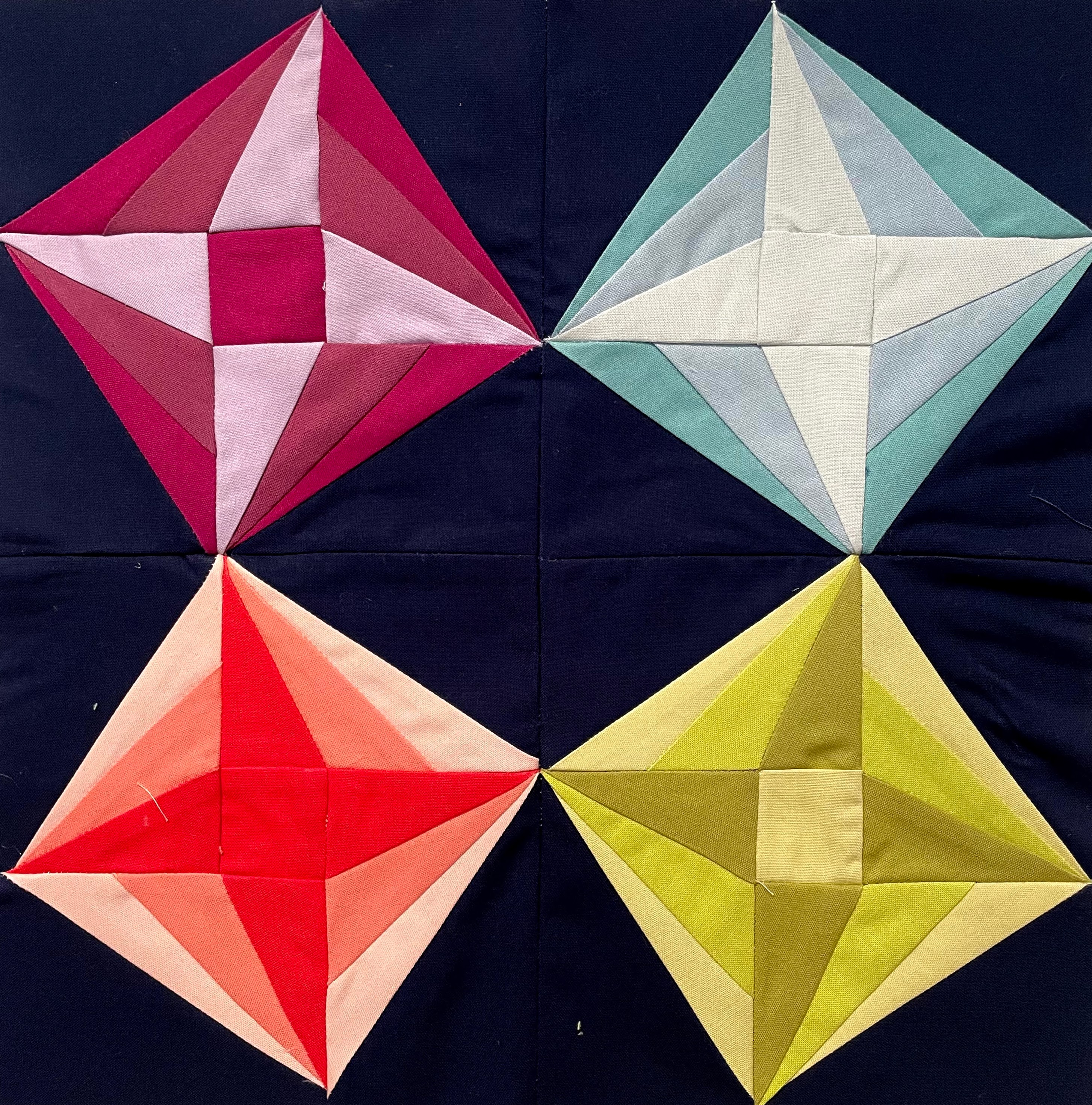
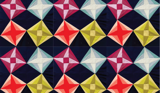
I made four blocks, and of course, as I made more, I added more colors. I like each block having the dark background, then three colors – light, medium and dark, although not as dark as the background. I played with value placement within each block, too. The pattern is reversed in half of the blocks.
And now for my favorite new trick – the mock up!
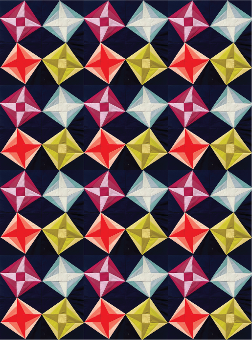
I love how reversing some of the blocks gives some extra movement to the quilt. There is quite a lot of bulk where all of the points come together. Since it is foundation paper piecing, I don’t have the control over which way the fabrics lie down. Also, that center square is less than 2″, and doing partial seams on a small piece is a challenge. I might enlarge the blocks and see if it makes construction a bit easier before I think about releasing it as a pattern.
Thanks for reading! I hope you like what I made. I have been enjoying these monthly challenges so much. It is a fairly small time investment, but it is a great creative exercise. My imagination definitely feels like it is getting renovated. Check out my post on Instagram and you can follow the links to all of the other participating designers.
Cool!
I love what you came up with. I agree that the curve block did lack something but also had potential. Of course, I also agree that avoiding tears and swears is a good thing.
Thanks, Kathleen!
Ooh, the curves are interesting and I hope you keep that idea percolating. And I agree; rotating the blocks for movement looks great. One of the biggest drawbacks to paper piecing is that I do tend to end up with super bulky points for my own designs (which therefore I table to think about and never do anything with). I think a little sashing or even purposefully making a bit of asymmetry are options to explore, but clearly I’ve not mastered that as a skill myself.
Thanks, Yvonne! You’ve given me great feedback, and I think I have a workable idea now.
Hi Jen! I saw this on IG last night and just had to come read more about these nifty stars. In your mock up, that lightest star really does shine. Very cool. I can’t wait to see where you go with these ideas and the curves, too. ~smile~ Roseanne