I’ve been working on my design skills. Not as hard as I’ve been working on client pieces, but working none the less. I’ve discovered a love for watercolor painting, thanks to Bethanne Nemesh, and a class with Ana Victoria Calderón on Domestika. Both teachers make it look easy to make beautiful things, and they are helping me learn. (Side note, shopping for paints, papers and brushes is almost as fun as shopping for quilting notions.)
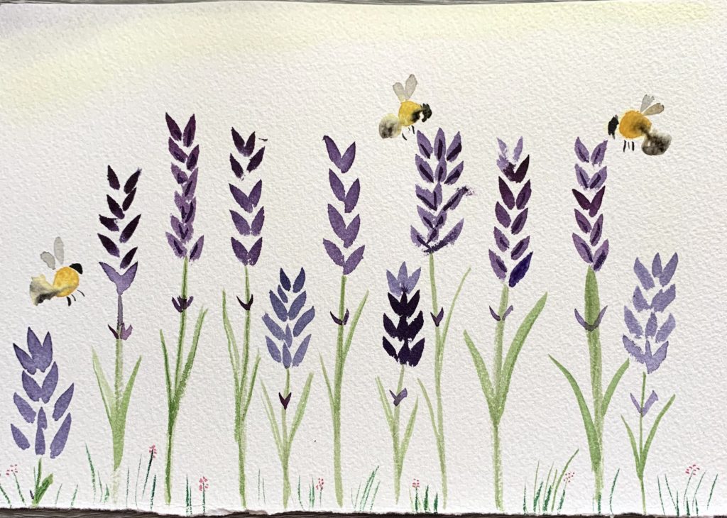
Bethanne offers a free class every Thursday on her Facebook page. I sit in live whenever I can. She puts together a lesson with a few pieces that are easy to replicate, even for rank beginners. Here are some of my attempts.
I haven’t progressed very far in the Ana Victoria Calderón class yet, because I became so entranced with the warm up exercises she had us doing. In fact, I’ve taken one, which I believe she calls “barritos” (she speaks in Spanish) and turned it into a repeating design for fabric. I used Adobe Illustrator, and this piece will be included in my first fabric collection in my portfolio.
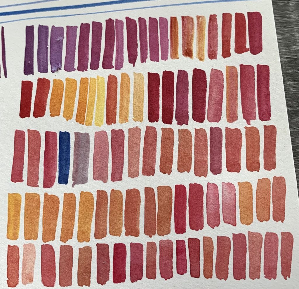
I worked with it in Adobe Illustrator to make it into a repeating pattern. These are the three versions I went through so far. First, it was just about getting it in, and vectorizing it. Then I moved bars closer to each other and filled in negative space by stretching some of them.

Then I did some more adjustments, to make the repeating block less obvious.
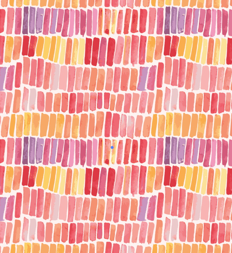
Then I decided that the purples had to go.

When this finally becomes a pitch for traditionally printed fabric, I will have to flatten it a bit, reducing the number of colors. For now, I want to keep the dimension. Since I’m using it for digitally produced fabric, I can leave it.
I actually liked it so much, that I decided to submit it to the most recent Spoonflower design contest. They have one every week, with different themes. This has been my second attempt at participation, and it has done loads better than my first attempt.
The theme for this one was “Quiet Spaces”. Somehow I didn’t realize it was wallpaper! So, the swatch they show is wallpaper, rather than fabric. The scale of this, on wallpaper, would make for a dizzying room, in my opinion. It makes a fab fat quarter, though.
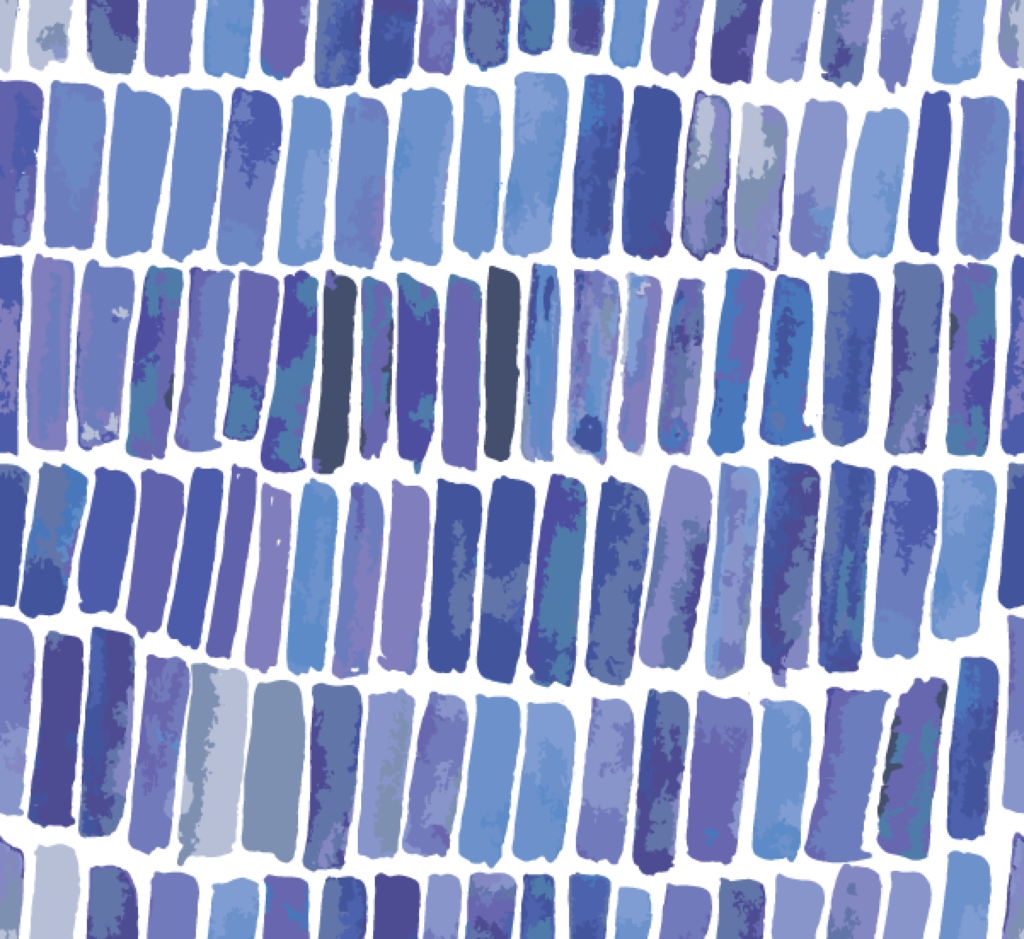
To follow the assigned theme, I decided to change the colors from the warm sunset colorway to a more subdued blue. I was able to just change colors in Illustrator, rather than repaint the entire piece. Technology is magical.

If you have time, I would absolutely love it if you cold go over and vote for me. It is asking a lot, though, because there are hundreds of entries, and they are in no particular order, and are not searchable.
What do you think? I’m enjoying this adventure so much. One thing that has helped lower my stress levels was realizing that there is no timeline on this journey. I can take my time and explore making art, rather than scrambling to get my work in front of art directors immediately.
I hope you are staying safe and healthy, and feeding your creative spirit.



Voted for you! So proud of you for branching out into a new art.
What a great adventure! I love the fun you are having with this. The editing process to the final piece is fun to think about too! Oh, and facebook tells me it is your birthday..have a fabulous day!
Done! What a cool idea, wish I could buy a sample of each. Love your design.
Soon!